Data Driven Pages V: UTM Grids for Multiple Scales
Submitted by geobugAt my day job, I work with field scientists who work in some pretty remote places, and one of the things I'm frequently asked to do is to put a UTM grid on maps they'll take out with them into the field. Adding any kind of measured grid to your map document is a breeze in ArcMap. And if you're using data driven pages (DDP) and your pages are all the same scale (or nearly so) then you needn't take any further steps to accomplish your goal.
However, if you're using DDP and your pages are wildly different scales, you're going to turn up with this problem:
(From left to right: The Good, The Bad, and The Ugly.)
Recall what we talked about last time with arcpy's tenuous ability to influence layout elements? Well, here we go again. Arcpy can't get into the measured grid to change its properties. It would be really groovy if we could get in there and just change the grid interval. But wishing is not an effective means of change. (Mercilessly hassling the arcpy.mapping guys at user conference might be though; I keep testing that hypothesis.) So what we need is a work around.
We come back to those same two options we discussed with the scale bar issue last time. You can hit ArcObjects from your python code on export. That's not bad. It will only work on export though, so while you're working with your map you'll either be looking at the those horribly spaced lines while you navigate and edit, or you'll have to shut them off so your inner-cartographer doesn't go berserk. ...Or we can cheat. In this case, that means turning our layout items into data that we can easily manipulate.
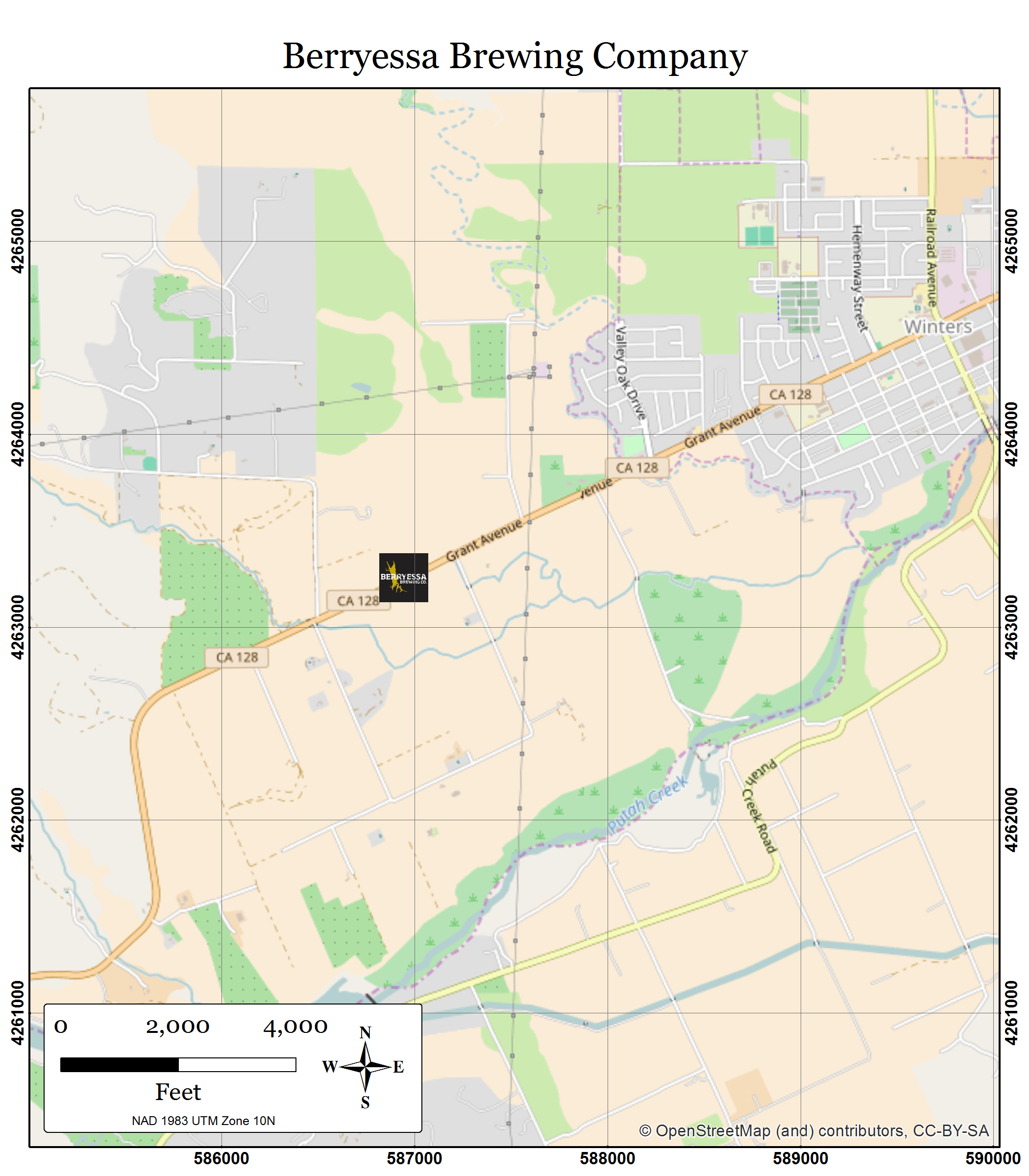
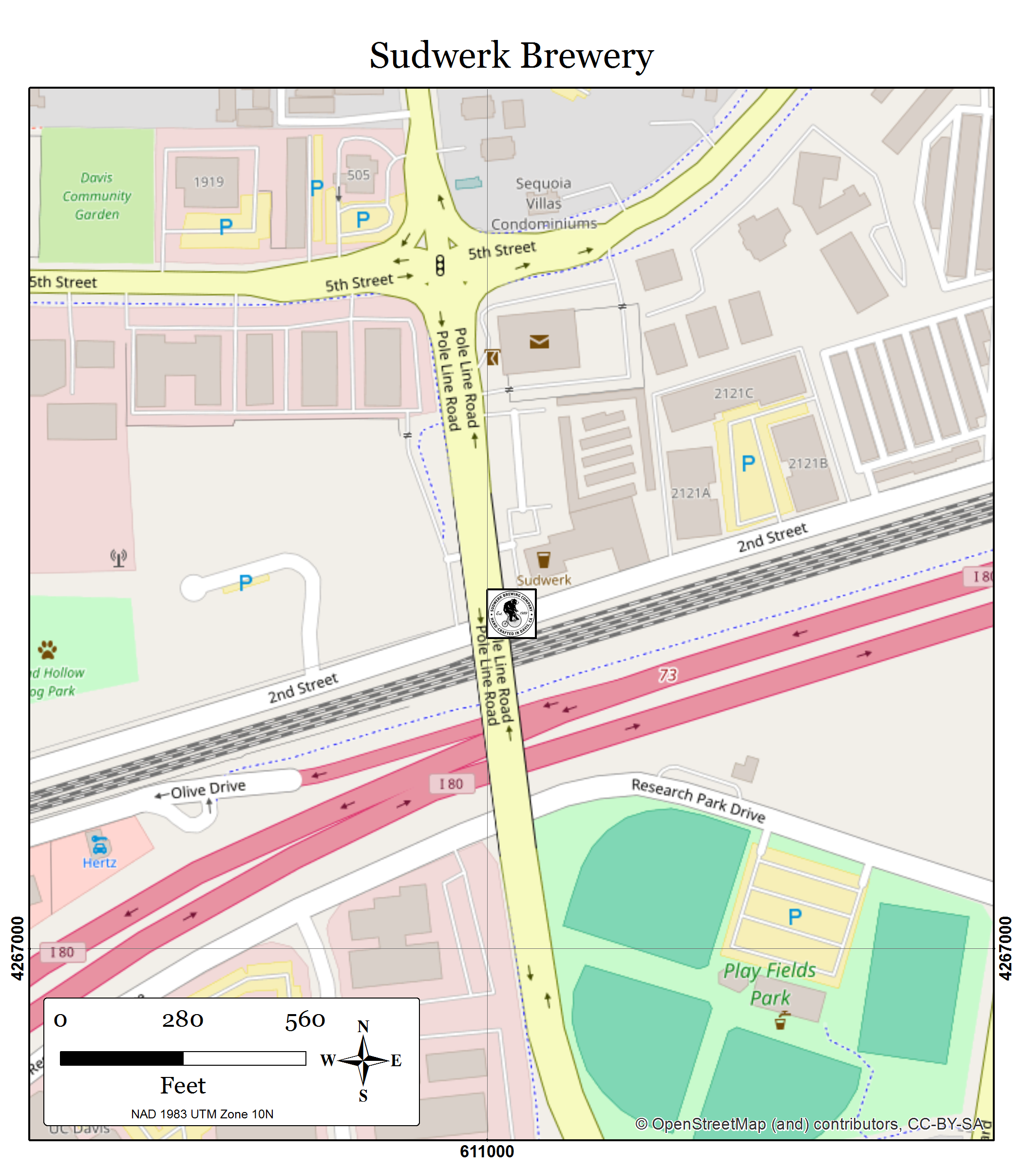
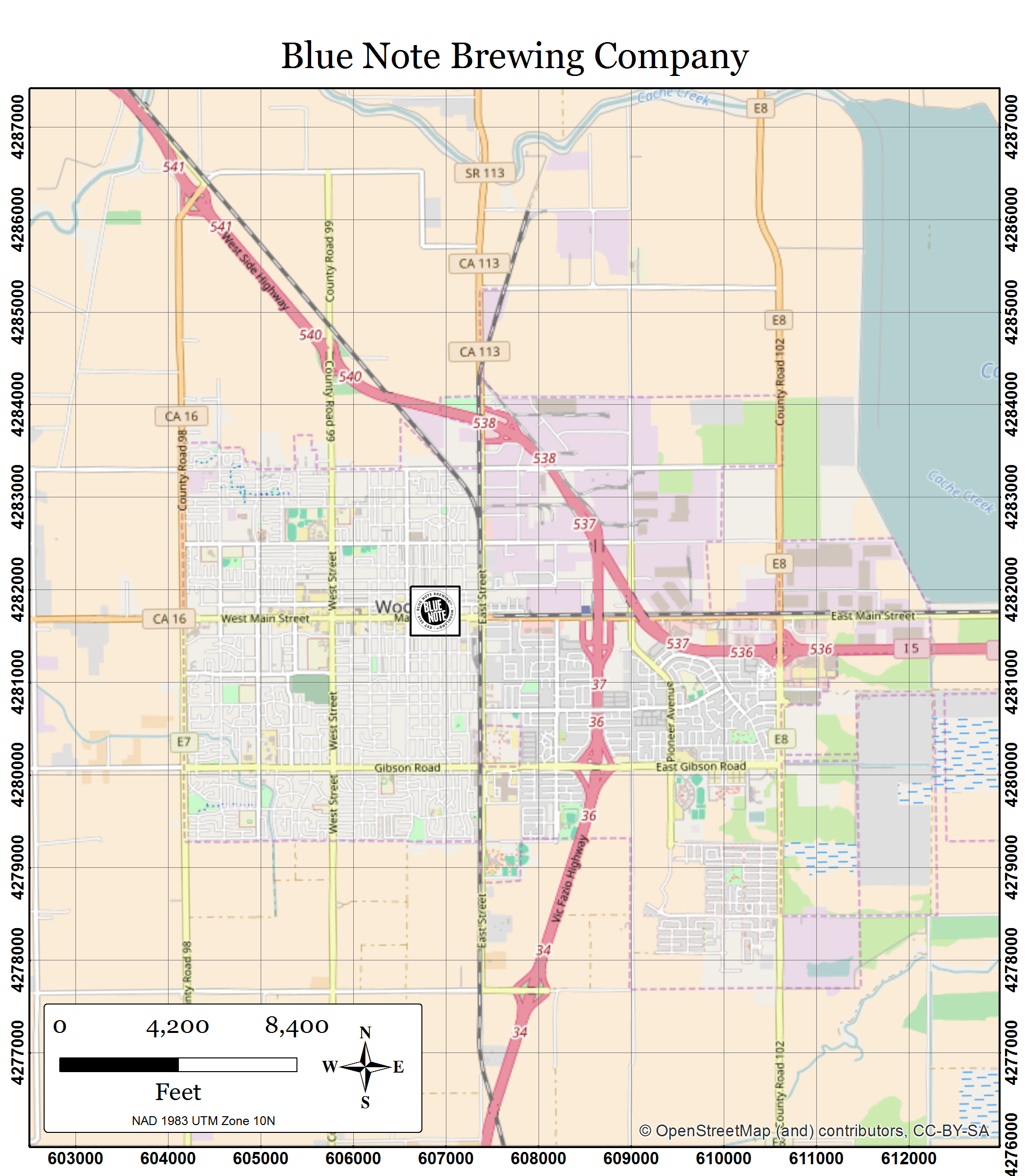
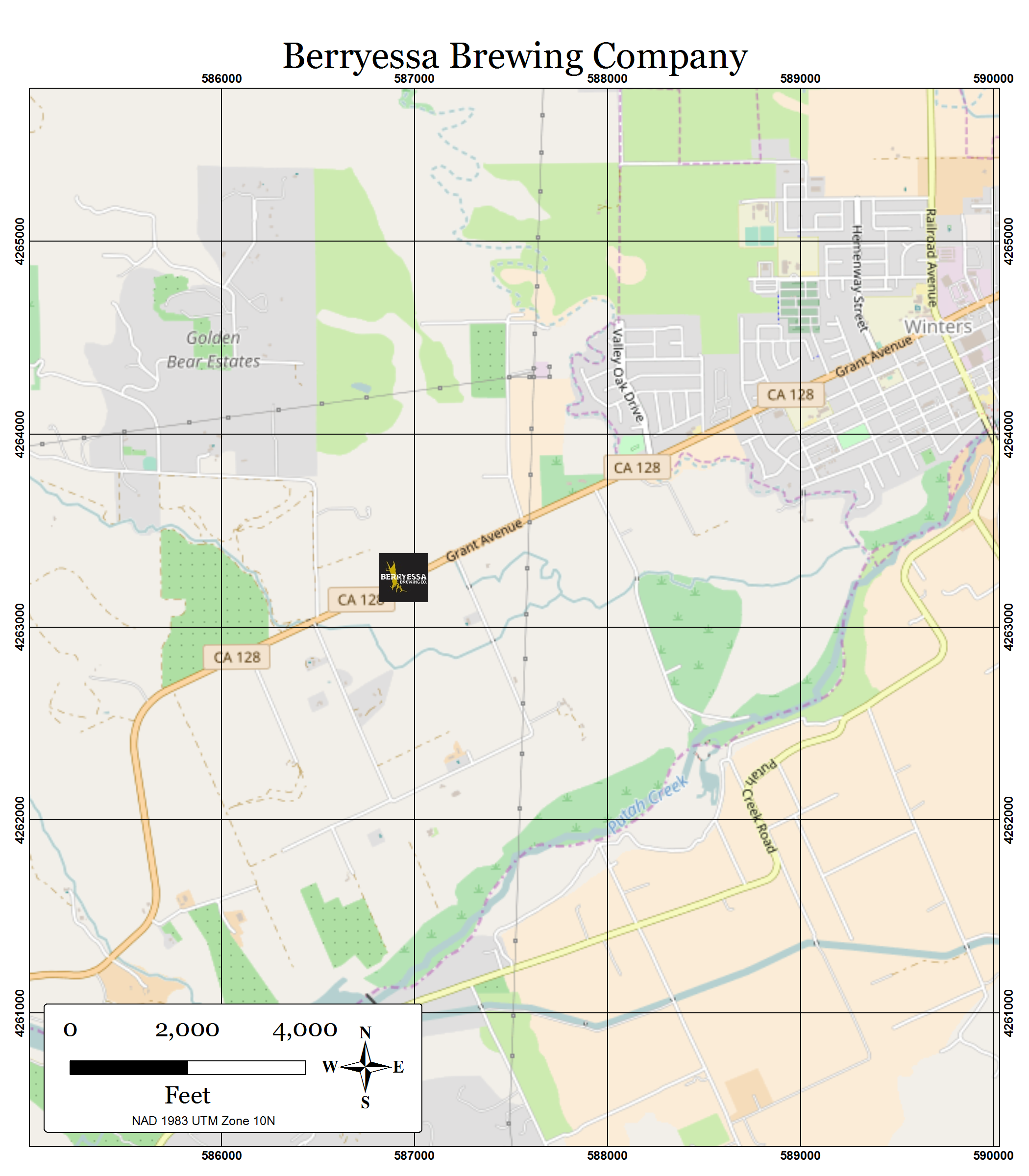
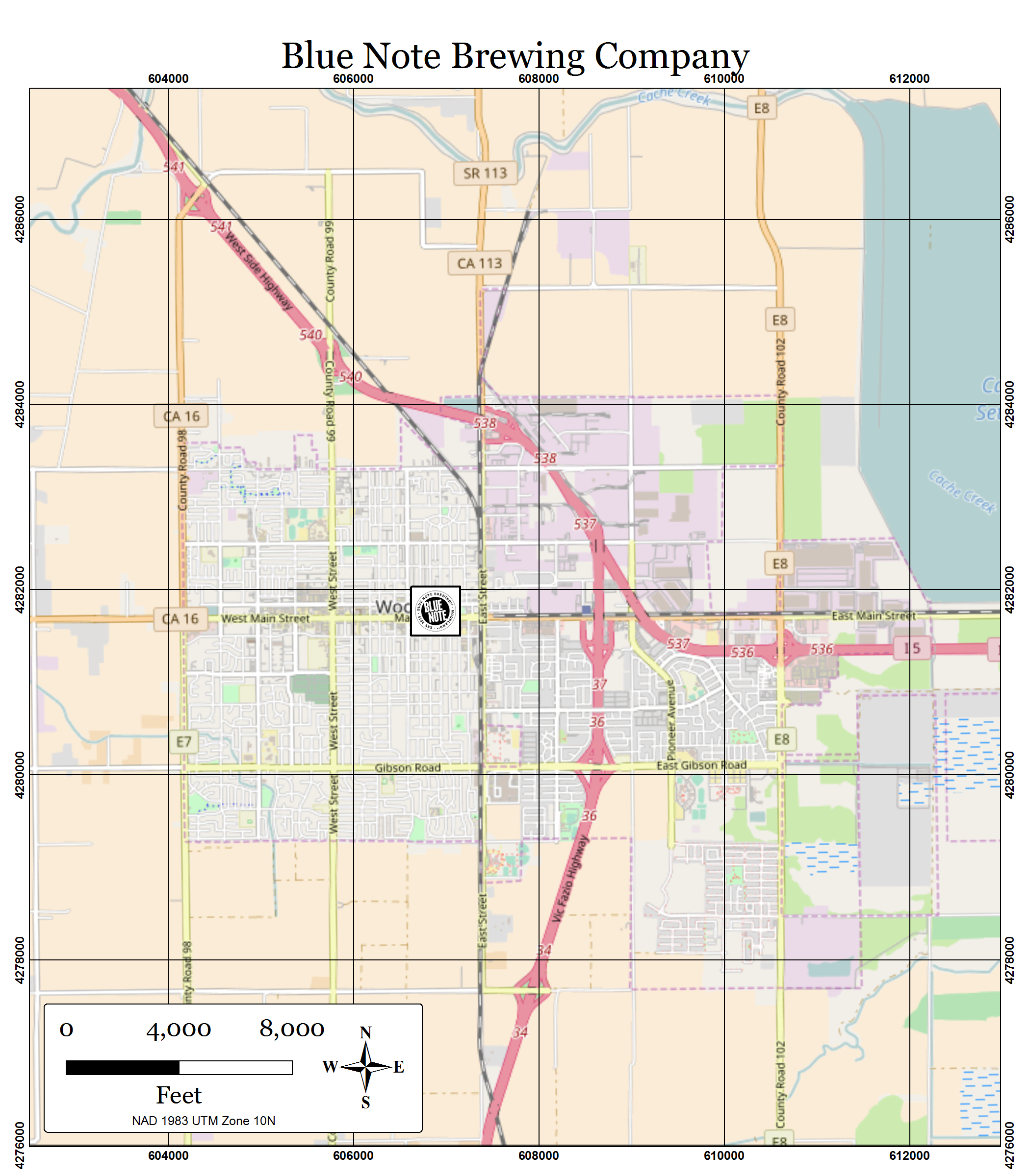
So, let's say we need to update our brewery maps for people who really want to find beer, like with sub-meter accuracy on a Trimble. As in our last example, we have an mxd set up with data driven pages, and we're using the data driven scale so that we can automate the scale change from page to page. Now we want to provide our users with some good scale dependent UTM grids on their maps to aid their noble quest.
What we're going to do is use python to make an linear feature class that represents UTM lines, and another point feature class that represents how those lines intersect with the outer extent of each of the index features running the data driven page series. The linear features will be our measured grid, the point features will provide our labels, and then a little styling, some scale dependancies, and some definition queries in our mxd will be all we need to make the final maps. I'm going to point you to code and layer files that you can use or pick apart for your own nefarious purposes, but first, let's break down the steps that the code is going to take.
- Preparing Your Index Layer
Before we get going here, we're going to need a nice clean index layer. As discussed in Part II of this series, it is often handy to have a polygon index layer running your data driven pages in which the feature shape matches the data frame extent of your desired map output perfectly. This is one of those handy instances.
- Making the UTM Grid
What we'll do here is make a single polyline feature class to hold all the UTM lines we'll need for display. The tool I've provided (see link below) makes a measured grid based on the current extent and spatial reference of the index feature class for the data driven pages setup in your mxd.
(Note that if you're data driven pages are in totally disparate locations -- say, a brewery in China, and one in Africa, and one in South America --this might be a bad methodology for you. That's going to be a lot of lines. You may do better to generate lines for each index feature separately in that case. As long as all your stuff is relatively close, say in the same UTM zone, you should be good to go with the tools I provided.)
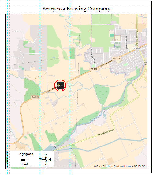
So what we're doing here is for a given extent, drawing a single line from north to south, starting at the maximum northing, and ending at the minimum northing, and then jumping over however many meters you specify to the east and doing it again, and again, and so forth. Then we'll repeat the whole process making east/west lines starting at the minimum easting and ending at the maximum easting. The resultant output will look like this:
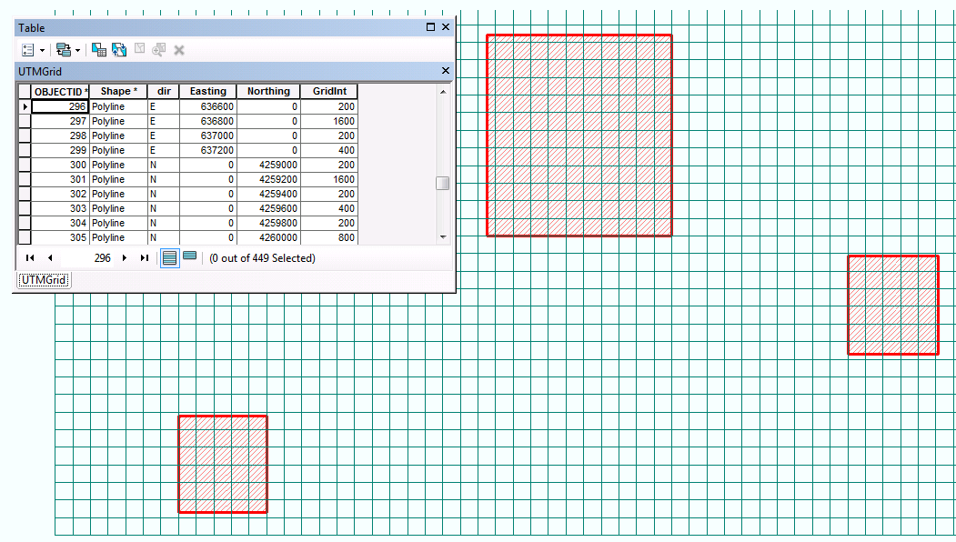
The code I wrote is going to chunk the grid intervals into four levels. So if you choose a minimum grid interval of 250 meters, it's going to look at the lines and in the attribute table, mark the coordinates that are evenly divisible by 250 meters, and by 500 meters, and by 1000 meters, and then by 2000 meters in the "GridInt" field. (Note: this is really easy to fix if those multipliers don't work for you. You can recalculate the "GridInt" field yourself using the field calculator, or get into the code and find a function called "getGridInt"to specify a different multiplier there.) We're going to use that GridInt field to set some display properties for the lines we just made.
In your ArcMap document, add that layer four times. In the layer properties for each, set a definition query on each so that it will show all the lines greater than or equal to the grid interval in question. And then click through your data driven page series and decide which scale ranges is appropriate for each layer.
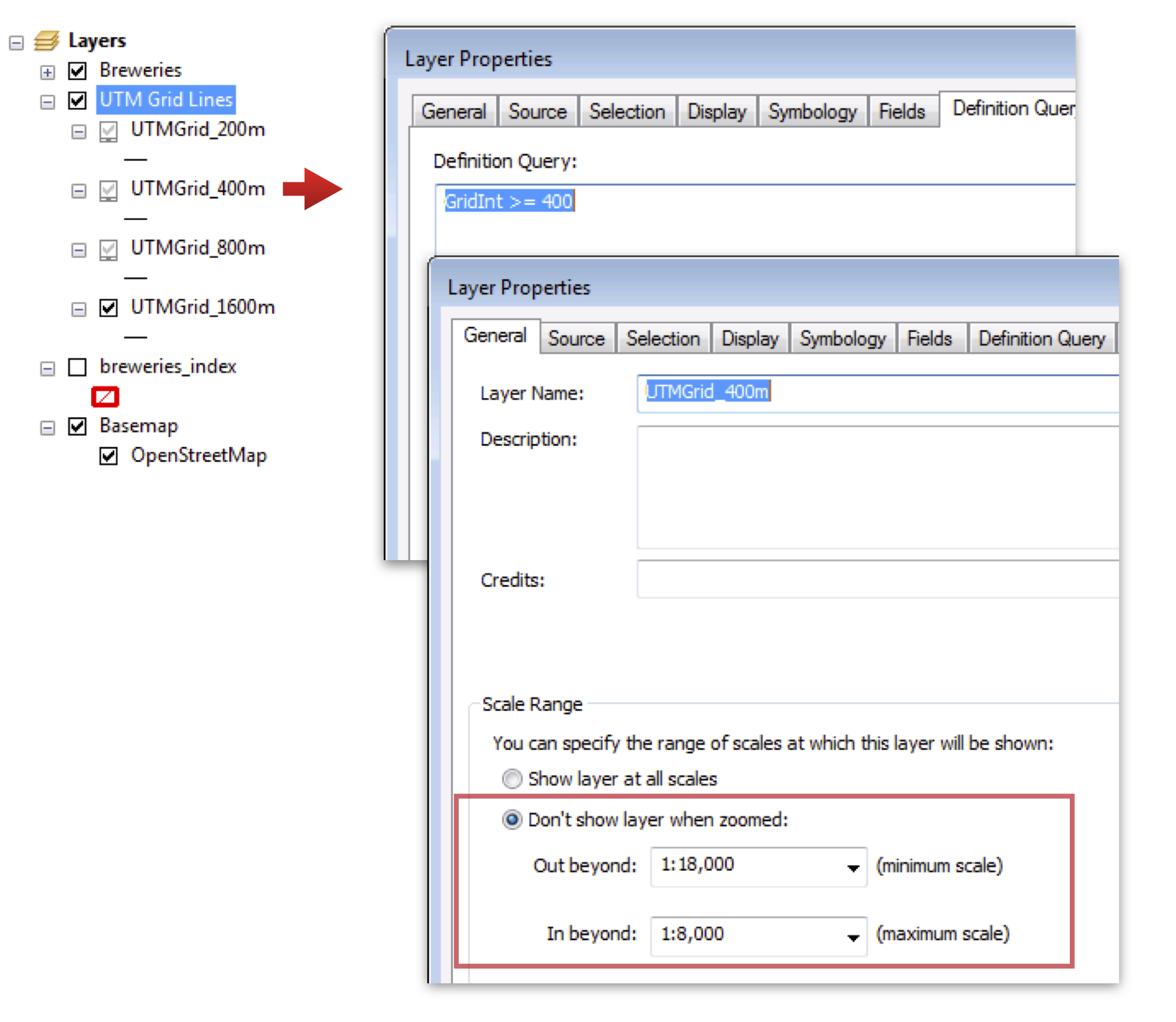
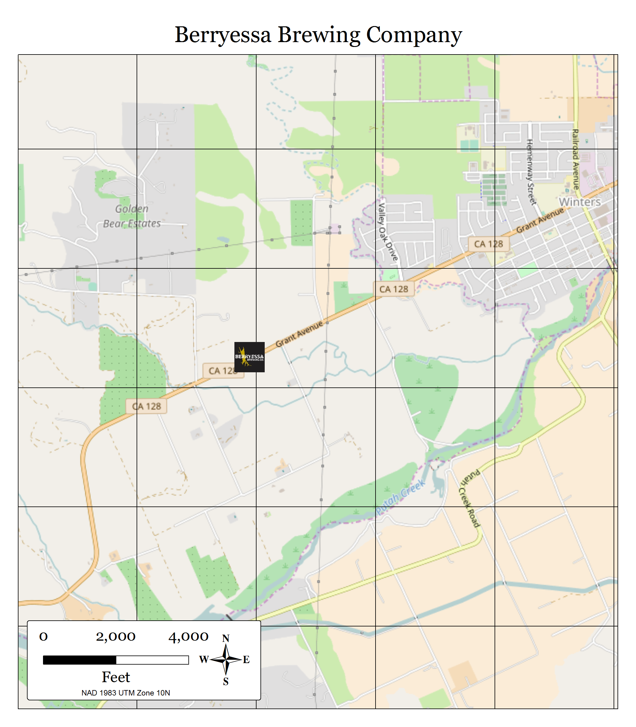
You can check out "Measured Grid.lyr" in the github download below to see how I've set it up.An added bonus of turning your grids into a feature class is that you can push them below other features in your map so that the lines won't fall across important symbols or annotation classes. Notice in the images below that our brewery logos appear above the grid lines. You can't control that using the native measured grid option in your layout.


- Generating Points for Labels
Okay, so now we have lines, and we could just label them on the edges and call it done, but in my opinion you can get more eloquent labeling options for this purpose if you're labeling points. Because we have UTM lines, and we have a polygon feature class that perfectly matches the extent of each map in our DDP series, we're going to intersect one with the other to get points that run around the edge of our page extent.
The resultant points are easy to label neatly with the grid coordinates, and also contain the DDP page name so we set up a data driven page query on the point layer so that the labels for given page are shown only on that page. (If your index features never overlap, you can skip the data driven page query.)
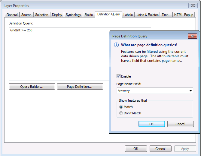
Use four copies of the point layer in your mxd and then set up the layer settings in your mxd just like the lines. Set a definition query on each so that it will show all the lines greater than or equal to the grid interval in question, and then click through your data driven page series and set the scale ranges to match the lines.
Now there's just one last step. In your data frame properties, set the data frame to clip to the page extent, and exclude the labels from the clipping.
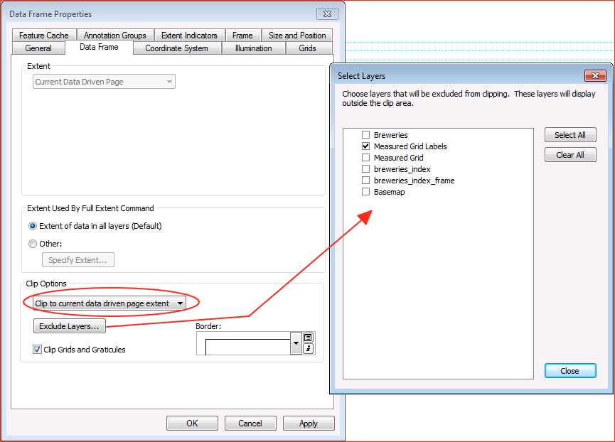
Then, in your data frame properties, just alter the size of your data frame a little bit on the Size and Position tab. Just bump it out 0.2" or so; what is required to give your labels room to show up around the page clip.
...And now we have a scale-dependent grid for data driven pages.

So, code is available in my git hub repository. Do with it what you will. And leave a comment for me if you need me to explain anything further.
Other articles in this series: